
ourCommonplace
our Brief
How can ourCommonplace bring transparency and knowledge to consumers who are in the early stages of becoming conscious of their buying practices which influence the mannerism of how mindful consumers shop?
my Teammates
Ella Yang, Onaiza Kazi, & Michelle Kim
my Roles
UX Researcher & Designer
our Deliverables
Affinity Mapping, User Flow, Competitive & Comparative Analysis, Journey Map, User Persona, Site Map, Sketches, Wireframes, Mid-Fidelity & High-Fidelity Prototypes
our Tools
Sketching, Google Suite, Miro, Zoom, & Figma
our Teaser
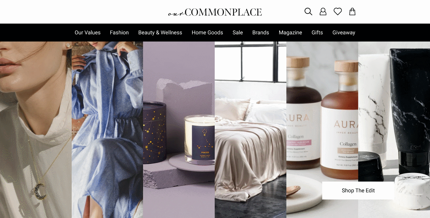
website View

phone View
our How
client Interview
Prior to doing any research, design work, or even brainstorming we had met with our client Sunny who is the owner of ourCommonplace. She told us her business goals, where she saw it going, and what she could do to further succeed in this space. Some of the main points that stood out was that she partners with local & small businesses that were sustainable friendly, she also wanted to know what people were thinking and feeling when they went on ourCommonplace, and how she could increase the conversion rate to her site.
user Interview
We as a team interviewed 6 conscious consumers who were in different stages of being a mindful shopper. We conducted 5 usability tests on ourCommonplace site and found 80% of them wanted transparency when going through the site. At last we came back to the users and conducted 4 usability testing with our own version of a redesign of the Home Page, About Page, Navigation, & Product Detail Pages
our Data
user Expectations
80% stated transparency
5 out of 6 users wanted a thorough ingredient list and fabric content
50% stated consistency with content uploading and brand message
user Sustainable Shopping Habits
44% of the users were sustainable shoppers/ conscious consumers
66% of the users were semi-conscious consumers
All Users currently make an effort to shop sustainably
83% of the users stated that they would purchase sustainable products despite the high prices
70% of the users bought clean skincare products
user Journey
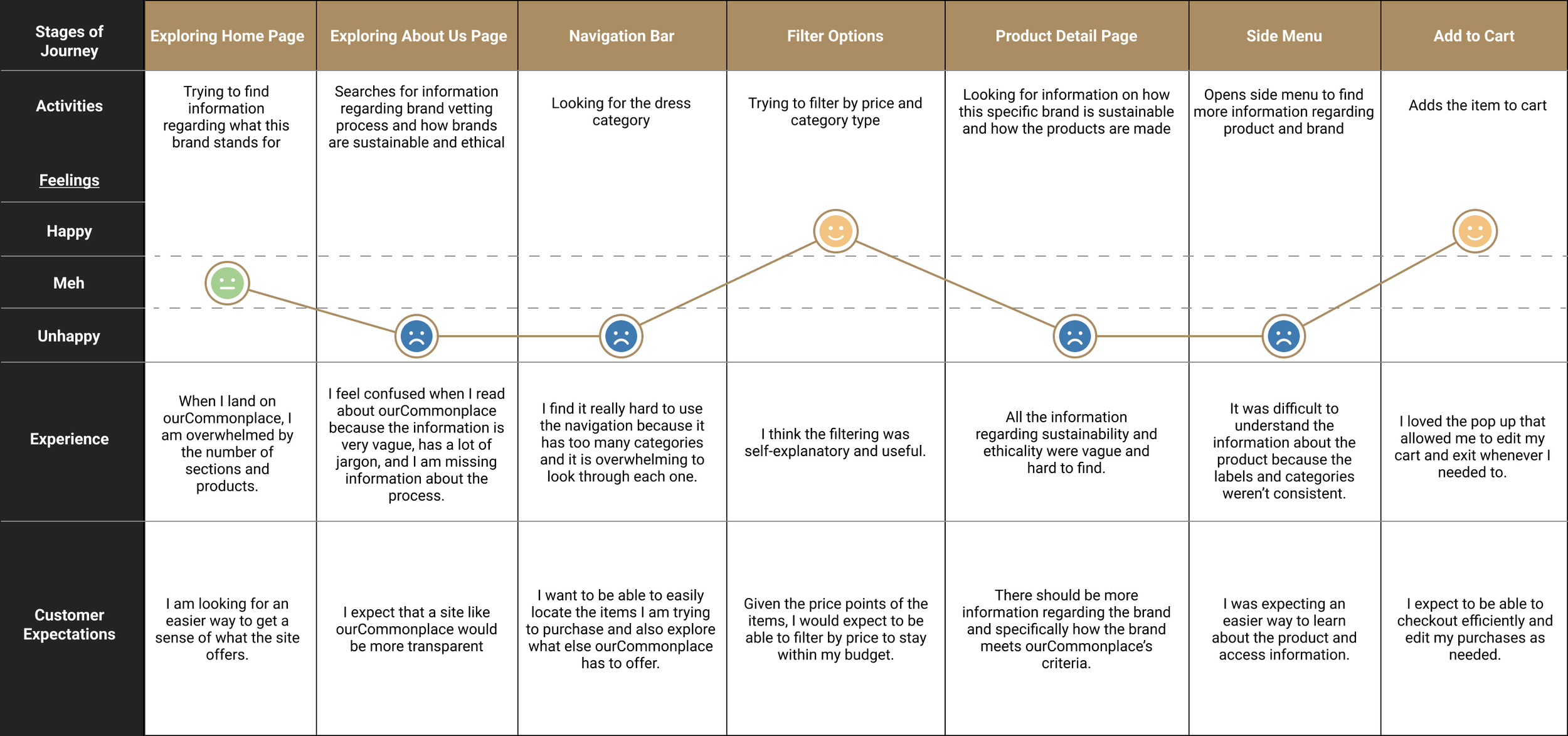
We simulated a user journey map based on the user interview & user testing to better understand what they were going through when they were navigating ourCommonplace. Many of the users were confused when there was a lot of information overflow and product variety as well.
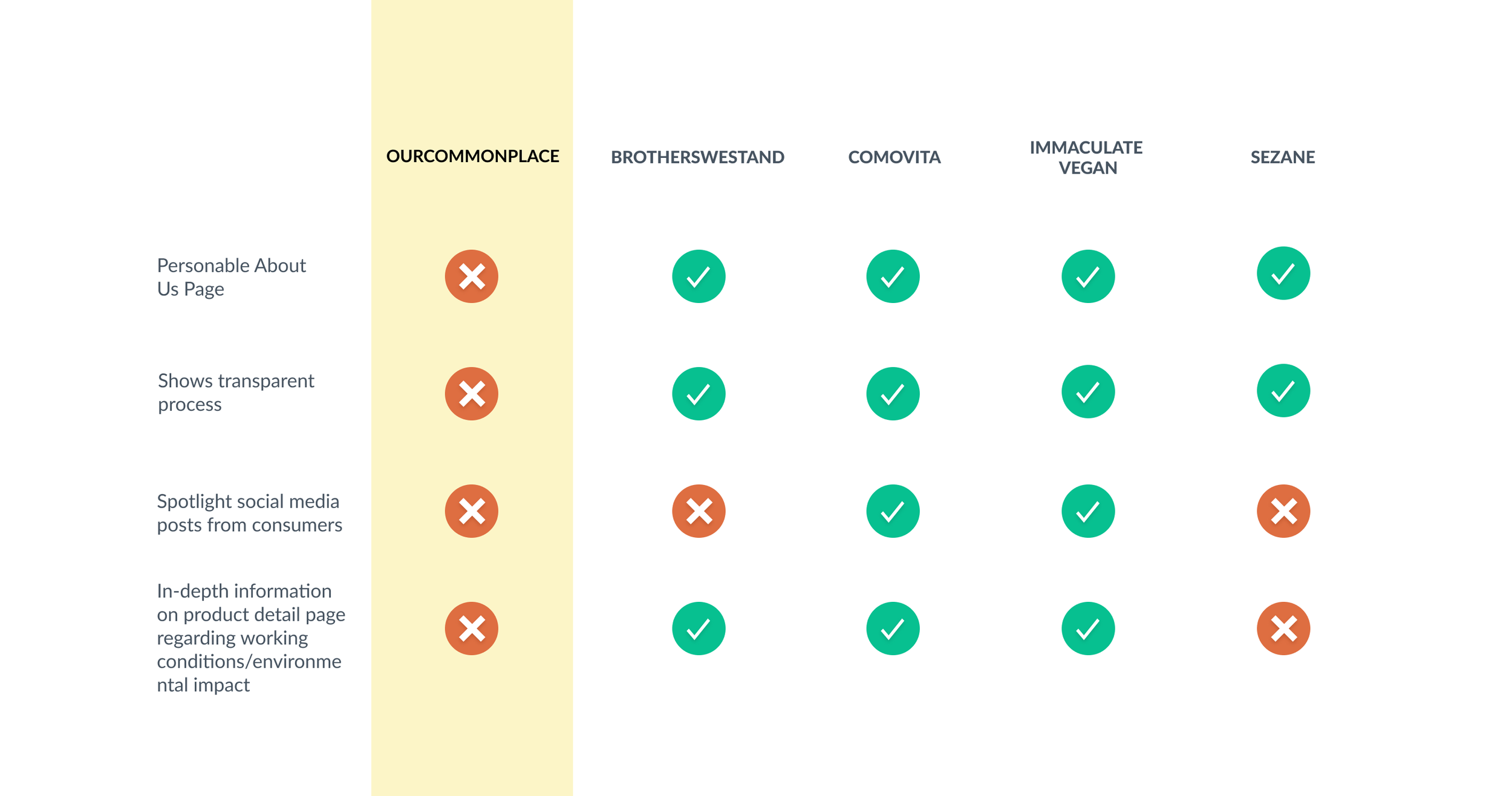
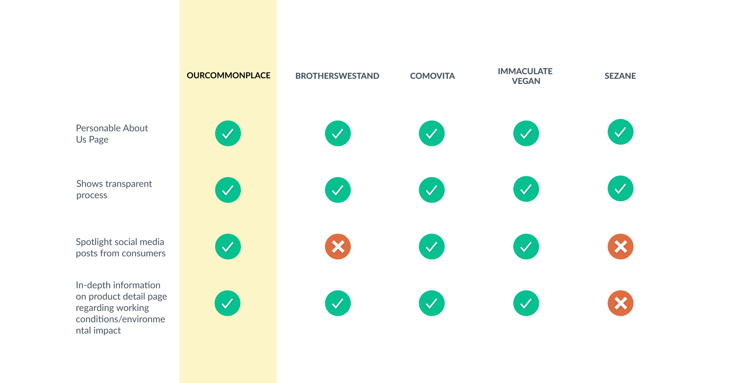
our Competitors
before Redesign
after Redesign
our Persona
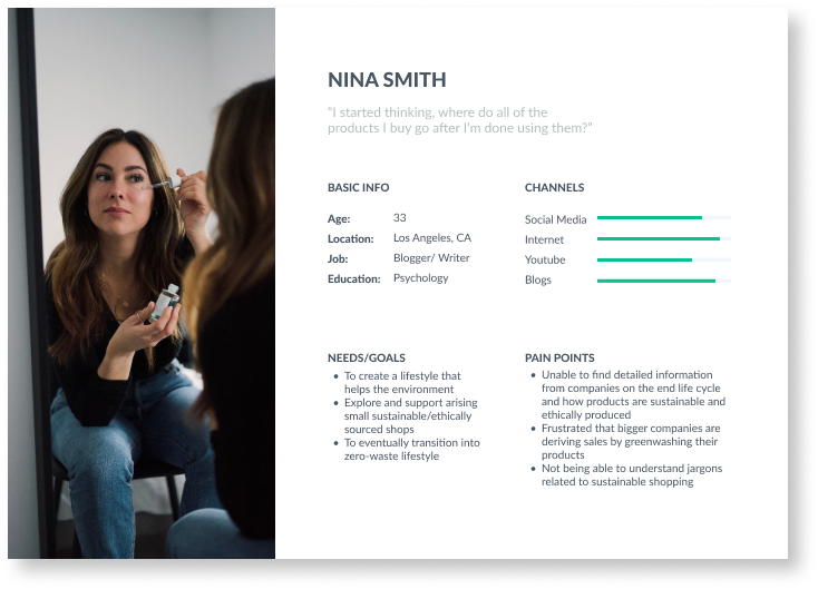
nina’s Obstacle
Nina, new to being a conscious consumer, is looking for a place she can trust to purchase quality goods that are ethical and sustainable. Nina believes in doing everything possible to build a world for the future generations and is looking to support small businesses and local artisans.
the Accommodations
In redesigning the homepage, about page, navigation, and product detail page we would give some relief to Nina navigating through ourCommonplace without an influx of disinformation and providing transparency while she shops online.
our Design
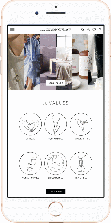
our Homepage
We introduced hierarchy on the homepage and featured ourValues so that conscious consumers knew they were on the right site for them. We prioritized categories to feature the best of what ourCommonplace has to offer.
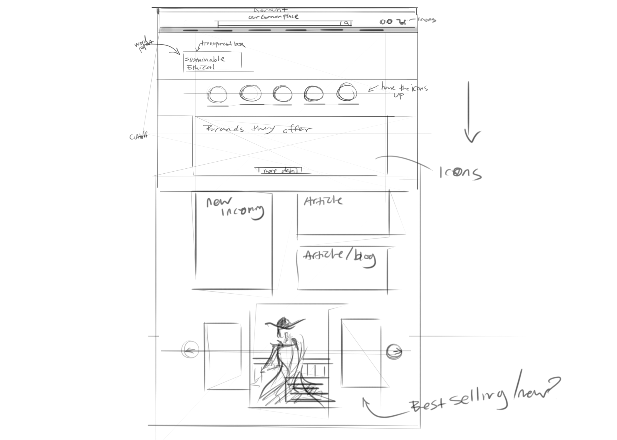
ourSketch

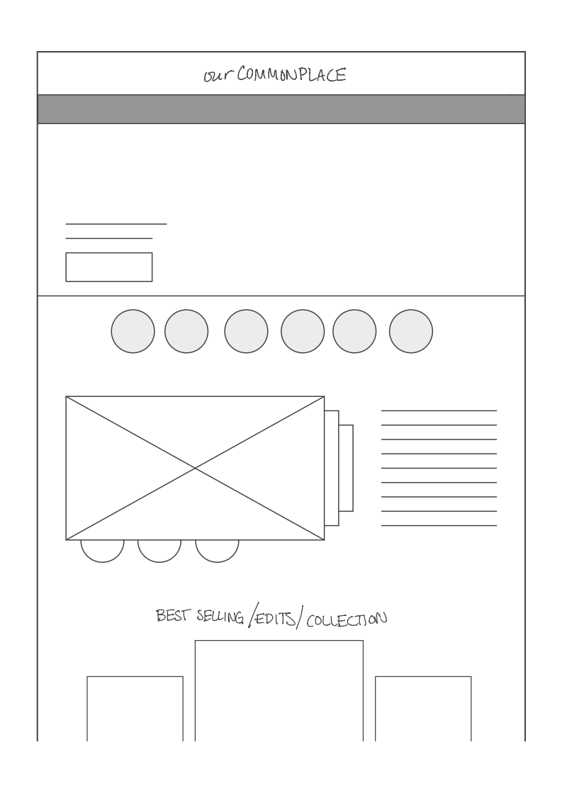
ourMid-fi
our Feature Content
We tailored the home page to feature small businesses and different product categories. Conscious consumers resoundingly indicated that they prefer to shop locally and like to support small businesses. Our team featured that as well as created a carousel that could feature other products or product categories.
our Sketch

our Mid-Fi
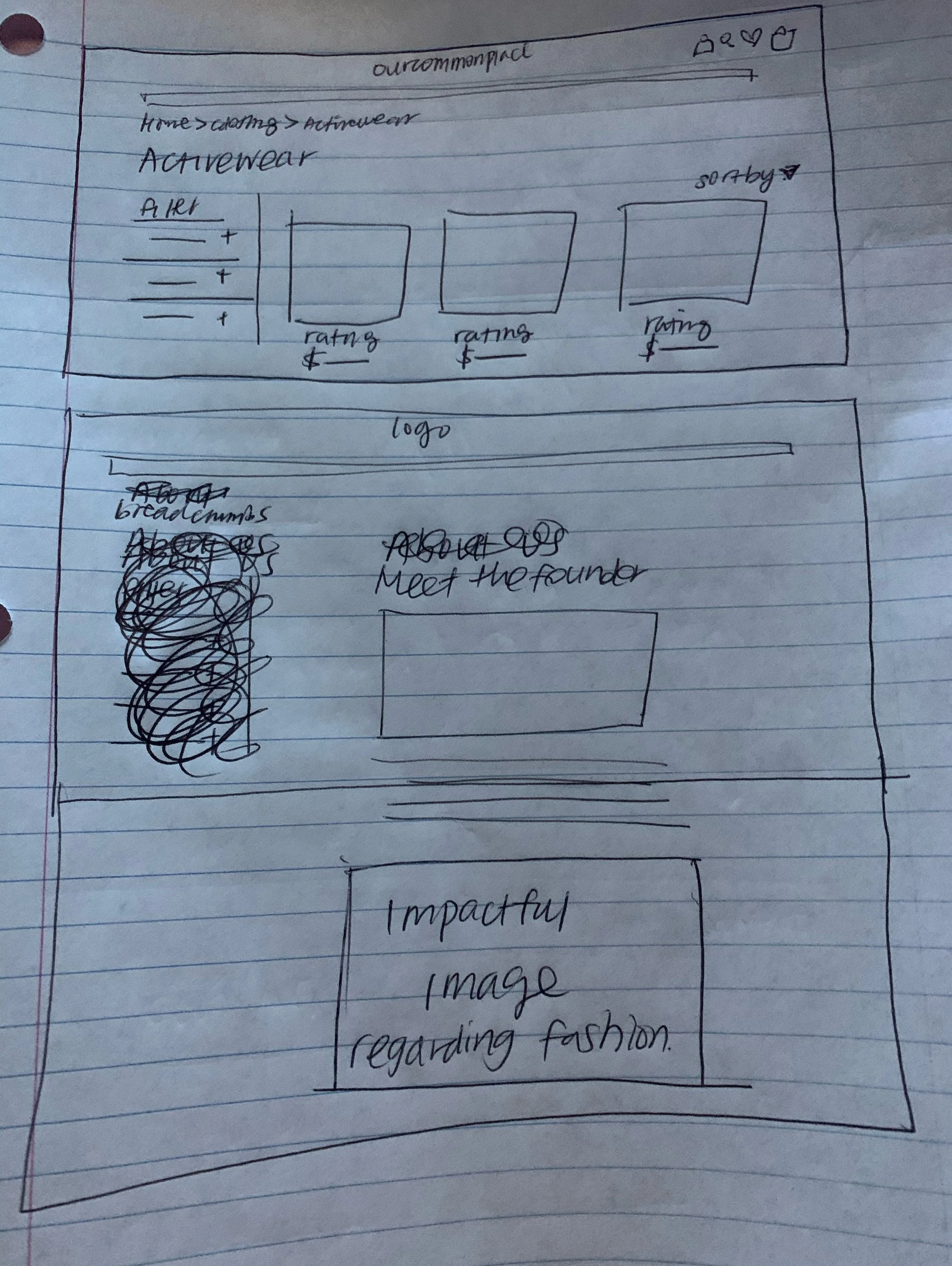
our About Us
We added a clear section on the about page to increase transparency for the users. We gave users a way to read more about each value and how the brands were vetted. The hovering bullet points were inspired by the UN Development Goals that are mentioned in ourCommonplace's CEO, Sunny's biography. We wanted to tie that into ourCommonplace as an indication of solidarity.

our Sketch

our Mid-Fi
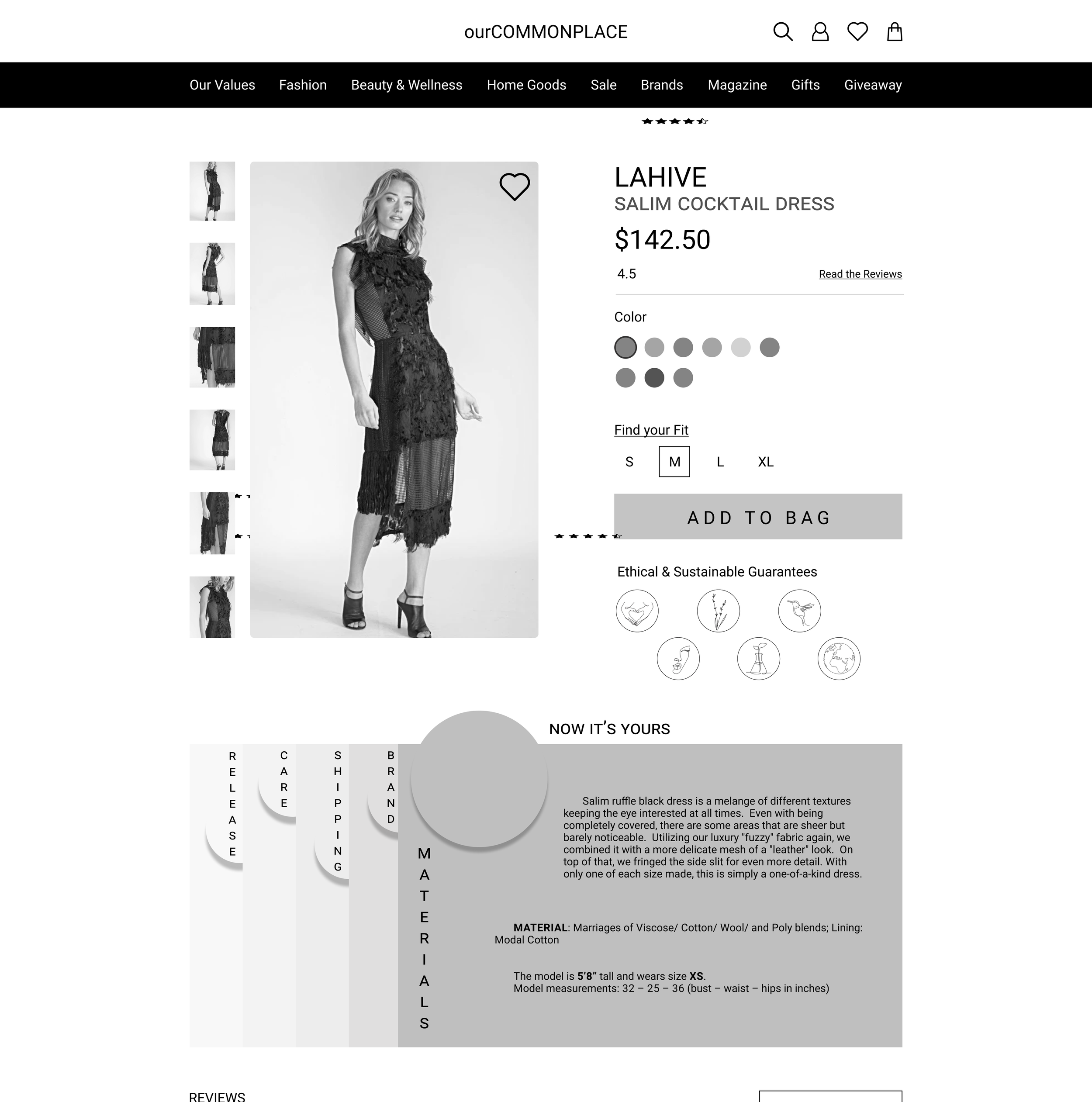
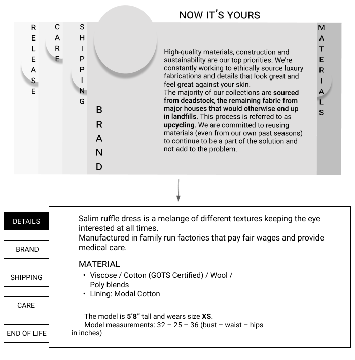
our Product Page
Our team implemented a new design for conscious consumers that crave transparency about every aspect of the life cycle of a product. The goal of this feature was to help consumers locate the information they want about sizing, reviews, materials, and care. We also changed the font and organization for legibility.

our Sketch
our Mid-Fi
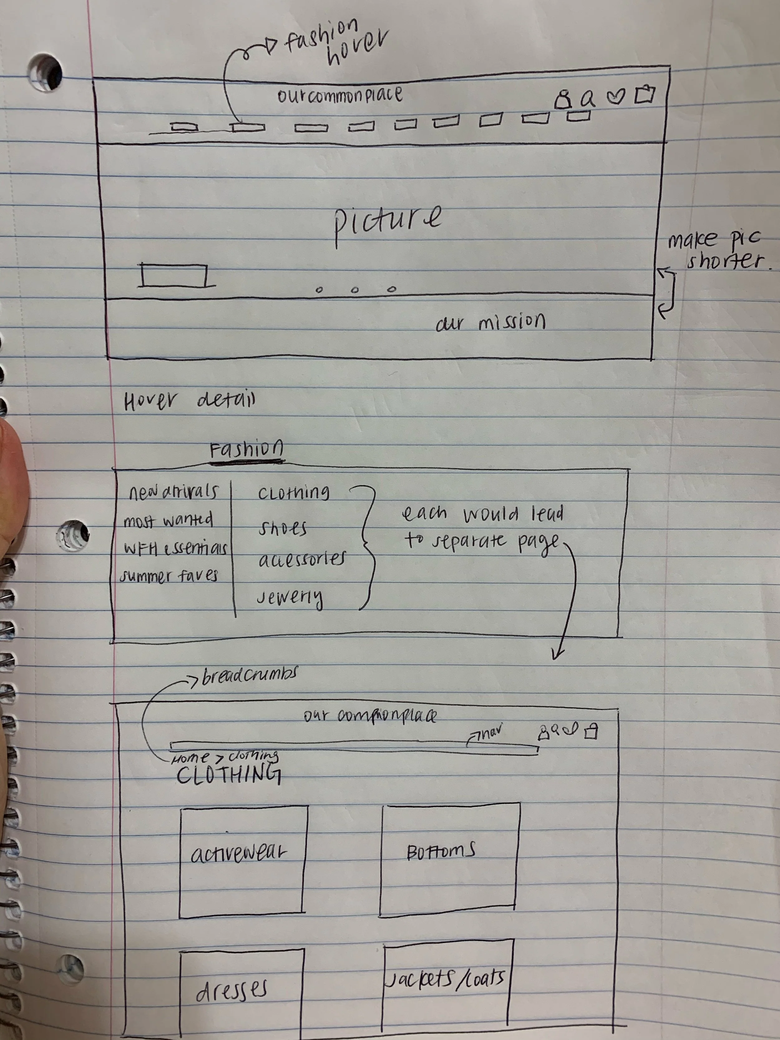
our Navigation
Our team experimented and tested a different version of navigation in order to decrease the information overload for users. We visually displayed the variety of products ourCommonplace sells and included featured inlaid banners as requested. Finally, we added visual hierarchy by adding a black background and dimming the rest of the page when hovering on the navigation.
our Idea

our Mid-Fi
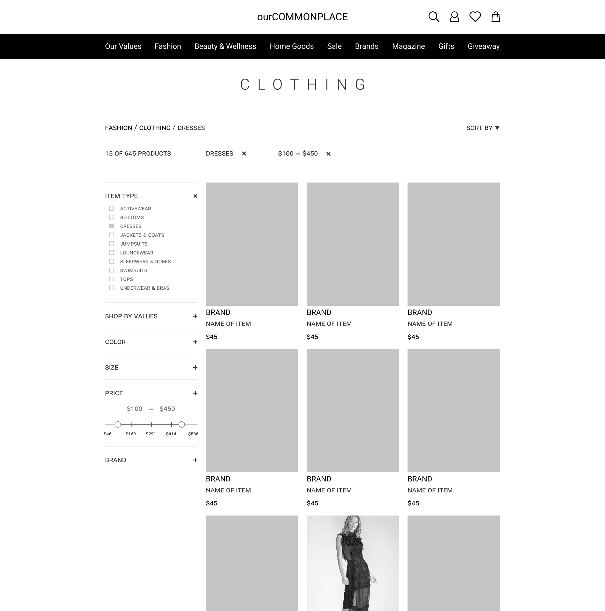
our Product Grid
Our team wanted to keep the existing structure that ourCommonplace has for a product search but wanted to add some e-commerce best practices. We added the ability to see the total number of products, and bread crumbs to help orient the user, and more prominently displayed the filtering criteria. We also designed a more consistent filtering system.
our Sketch
our Mid-Fi
our Changes
A few feature changes were made per our user testing on the mid-fi prototype. We had concluded we need to refine a few of the visuals and how some of the information was presented on the page.
One of the changes our users brought up was that they were not able to tell if the icons were clickable and did not exactly understand what the icons meant at first glance. We added a hover-over and had the title showing upfront.
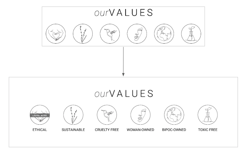
Users were confused on the brand feature and what they were representing. The new iteration brought up the icons upfront and when you interacted with them you are able to see each description on those icons shown
our Before
our After
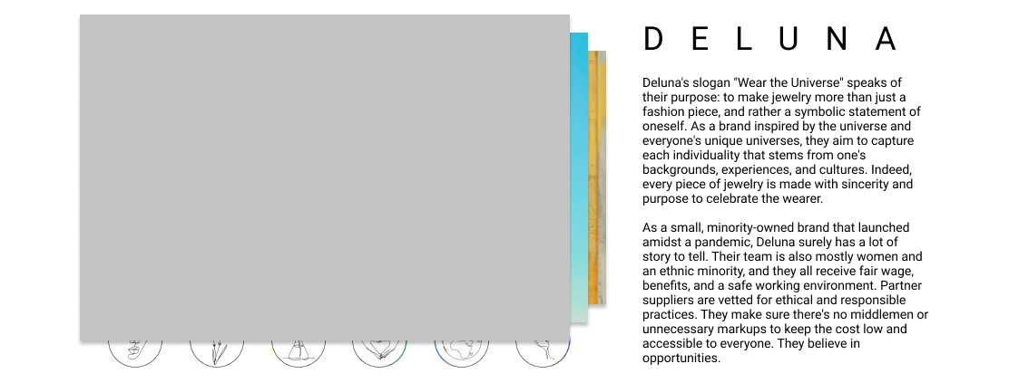
Not all of the users were brand aware with some of the companies ourCommonplace had featured on their site. We decided to use the brands original logo and put in some custom images of what the brands are known for.

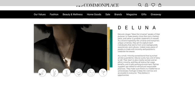
All of the users had found this interaction confusing and unnecessary on the page when you interact with it. We had decided to go simple with the design as it followed what ourCommonplace is about and changed it into tab markings with a card.
We also decided to redesign the architecture layout as it had confused a lot of the users with how it was laid out. We condensed the categories to show the most popular on the navigation bar. We also added a little glimpse of a picture on the side of what is trending/ what is being provided currently

our Final
I had created a finalized version for what the mobile would look.